AI-assisted, fast and scalable video production
VR experiences for trade shows, events and training
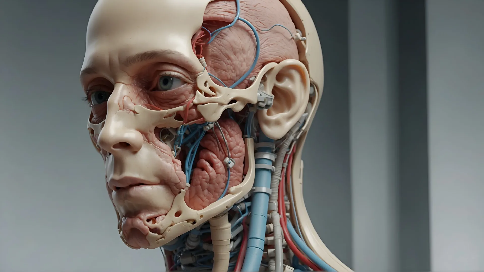
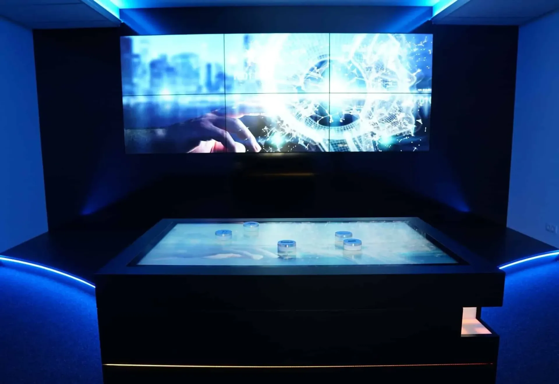
Touchscreen kiosk software and hardware
3D hologram display and stage solutions



ADIM · BRAND IDENTITY
Brand
Identity.
Logo, color, typography, tone of voice, visual language and brand applications. One reference for everyone who communicates as ADIM.
01 · BRAND CORE
We produce animation, film and immersive technologies for B2B brands — under one roof.
WHO FOR
Industrial, medical and corporate brands — those who need to explain a product, a process or a story with real impact.
WHAT
Animation, live action, AI video and immersive tech (VR, hologram, LED, interactive) — production from idea to delivery.
WHY
To show what a brochure or a slide can’t. To make the hard-to-grasp visible and memorable.
VALUES
End-to-end under one roof
From animation to live action, immersive tech to edit — the entire production sits with one team.
Creative direction is a human call
We use the most capable tools available; what to say and how to say it stays a human decision.
The right tool for the job
AI video, VR, hologram or LED — we work with whatever carries the project best.
Respect for the process
Brief, approval, revision, delivery — every stage clear, measurable and on time.
TAGLINE
From idea to screen.
Primary tagline
Fikirden sahneye.
Turkish original
USAGE
The tagline reads like a signature, not a sentence inside copy. It is never locked to the logo; it stands on its own.
02 · LOGO
One form. Two tones.


CLEAR SPACE
Keep the logo clear
Leave space equal to the x-height of the "A" on every side. No other graphic element may enter this zone.
MIN SIZE
24px screen · 12mm print
Below this, legibility isn’t guaranteed. Mobile favicon and embroidery are the exceptions.
COLOR
Black or white only
No third color. Emerald and other accents apply to surrounding elements, never to the logo.
DON’T
03 · COLOR
Three core colors. One accent.
The palette stays minimal. Black and cream are the base; emerald is used for emphasis and CTAs only.
CORE
EMERALD (ACCENT)
NEUTRALS (TEXT & BORDER)
04 · TYPOGRAPHY
Two families. One system.
HEADING
Syne
A modern, geometric sans-serif. For all headings and display use. Light, Regular, Medium, SemiBold, Bold, ExtraBold.
GOOGLE FONTS · DOWNLOAD →BODY
Inter
A broad family optimised for on-screen reading. For all body, captions and text. Light, Regular, Medium.
GOOGLE FONTS · DOWNLOAD →SCALE
DISPLAY
Syne · 300
96 / 48 px
HEADING 1
Syne · 300
64 / 36 px
HEADING 2
Syne · 300
40 / 28 px
BODY L
Inter · 300
18 px
BODY M
Inter · 300
15 px
EYEBROW
Inter · 400
11 px
05 · VISUAL LANGUAGE
Plain frame. Concentrated light.
No over-saturated color, stock photography or illustration. The brand leans on the raw reality of the production environment.
Photography
Cinematic, natural light. Not staged studio — the raw texture of a real production environment.
Video
Calm, controlled edits. Cool-neutral grade; clarity over spectacle. No gratuitous effects.
Motion
Purposeful, fluid transitions. Nothing bouncy or distracting — every move has a reason.
Iconography
Thin-line, consistent, minimal. Not decoration — a mark that speeds up meaning.
Illustration
Not used. The brand is built on the realism of photography and animation.
06 · BRAND VOICE
Plain. Direct. No throat-clearing.
ADIM avoids boilerplate corporate language. It speaks clearly, briefly and concretely — every word does a job. This tone applies to every written touchpoint: web, proposals, email, social and decks.
DO
- +Short sentences, plain language. Every line does a job.
- +Talk outcomes, not jargon: "use it in your export deck" — not "optimise your value proposition".
- +Be concrete: real work, real client, real numbers.
- +Professional but not distant — from inside the work, in a "we" voice.
DON’T
- ✕Empty corporate filler: "innovative solutions", "synergy", "ecosystem", "value proposition".
- ✕Absolutes: "perfect", "the best", "flawless".
- ✕Marketing hype: "revolutionary", "world-changing".
- ✕Lead with the work, not yourself — proof, not praise.
IN CONTEXT — GOOD / BAD
GOOD
Show your industrial product’s internal mechanism in 3D animation and use it in export presentations.
BAD
Elevate your brand’s value proposition with innovative 3D animation solutions.
GOOD
New work: we explained a medical device’s mechanism in 60 seconds. The whole product in one frame.
BAD
Another revolutionary, industry-defining project in the books! 🚀 #innovation
GOOD
Got the brief. We’ll come back Wednesday with a first edit.
BAD
Your request has been received and a response will be provided at the earliest convenience.
07 · BRAND IN USE
The identity at every touchpoint.
The same system holds on screen, in print, on a trade-show display and in conversation. A few core applications:
EMAIL SIGNATURE
Full Name
Title · ADIM
adim.tech · info@adim.tech
Dark logo block + thin vertical divider + name/title. No slogan, no stack of social icons, no colored background.
Deck cover
FROM IDEA TO SCREENPRESENTATION
Dark cover, cream interior pages. Syne headings, Inter body. One idea per slide.
NEW WORKSOCIAL
Square or 9:16. Dark ground, one image, short headline. No emoji or hashtag pileups.
İstanbul · AnkaraFull Name
Title
info@adim.tech · adim.tech
STATIONERY
White ground, dark logo, generous space. Two offices — İstanbul and Ankara — set in the top corner. The single accent is emerald, and only when needed.
TRADE-SHOW & SCREEN
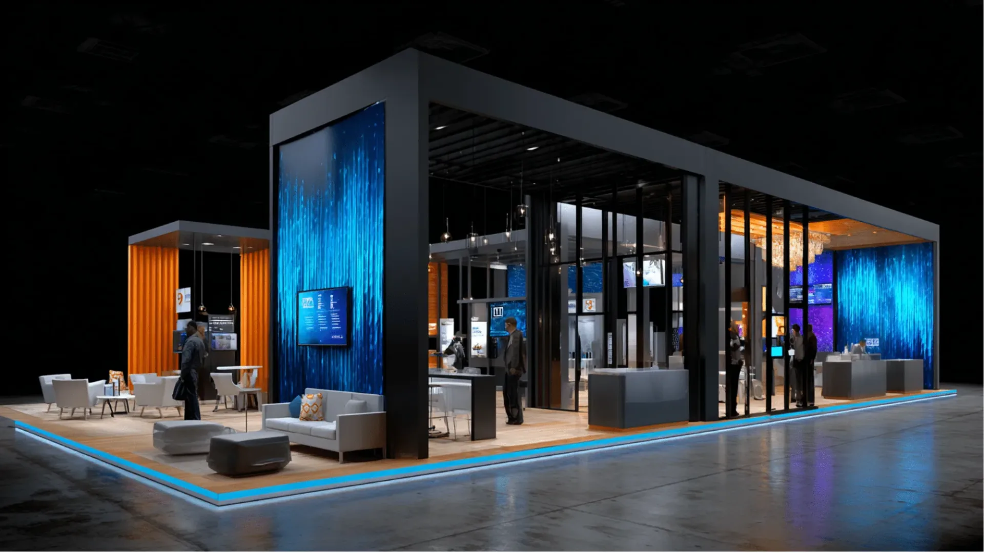
High contrast, simple composition on LED and digital screens. Calm motion, a single message.
CO-BRANDING · LOCKUP
PARTNERIn joint work, two logos sit side by side at equal optical weight, split by a thin vertical divider. The gap between them equals the height of the ADIM logo. No logo looms larger than the other.
08 · ASSETS
Everything in one pack.
Logo Pack
SVG · PNG · PDF · EPS — dark and light
REQUEST →02Color Palette
HEX · RGB · print values
REQUEST →03Typography
Syne + Inter — web and desktop fonts
REQUEST →04Deck Template
Keynote · PowerPoint · Google Slides
REQUEST →05Email Signature
HTML template — Gmail compatible
REQUEST →06Social Kit
Story · Post · Cover templates
REQUEST →QUESTIONS
For any brand use,
reach us directly.
Logo, assets, deck template, written content or any brand usage that needs to be clarified.
BRAND@ADIM.TECH